The decision to use the abbreviation as an integral part of the logomark
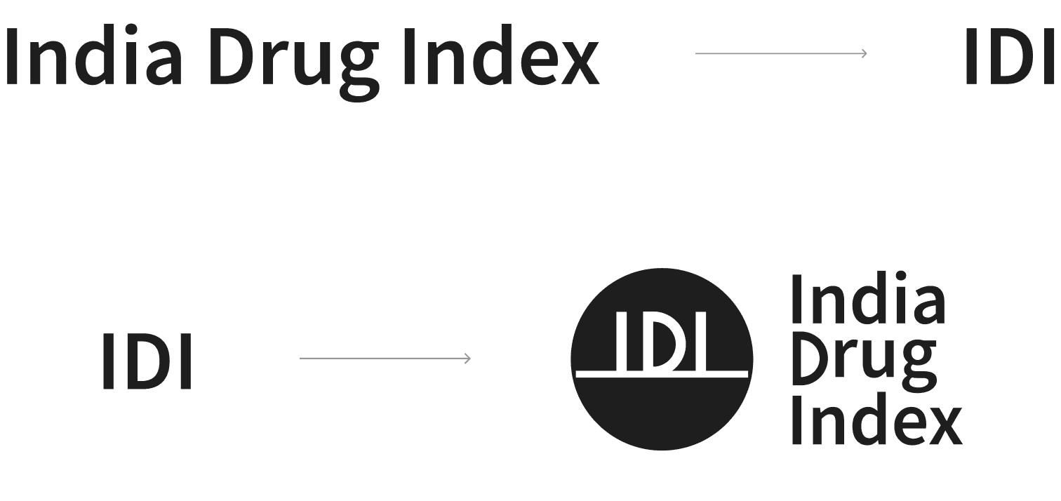
Since India Drug Index may not yet be widely recognized, integrating its abbreviation “IDI” directly into the logomark was a deliberate choice to simplify brand recognition. This approach reduces the cognitive effort required from the audience as it immediately links the symbol (logomark) to the organization’s name.

Switching from the old logomark to a new name-driven design
“IDI” has been embedded in the visual identity of the logo in a manner that not only enhances name recognition but also grounds it in the company’s context, ensuring the mark feels meaningful, and easily associated with its purpose. The new design marks a departure from the previous symbol which lacked an abbreviation. The new design subtly references a tablet - continuing to highlight the organization’s focus on medicine.


Communicative. Recognisable. Contextual.
The logomark is designed to be instantly recognisable, directly tied to the name, and grounded in the company’s context. It communicates clearly, making the identity easier to recall and connect with.


© 2025 Arianth tejas
All rights reserved